
Dreamland Diner
A nostalgic diner identity made for good food, brighter days, and a little everyday escape.
Dreamland Diner is a rebrand inspired by the warmth, optimism, and unmistakable character of the classic American roadside diner.
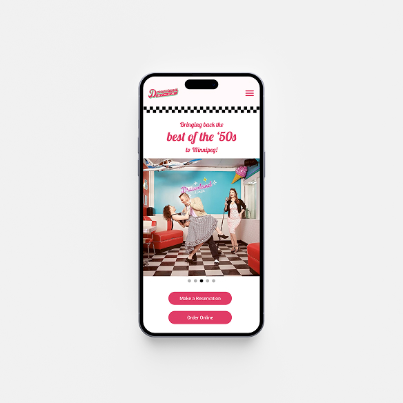
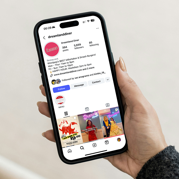
The new identity brings that nostalgia forward, balancing familiar diner cues with a brighter, more expressive system designed to feel at home across signage, packaging, menus, and digital.
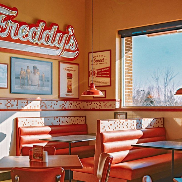
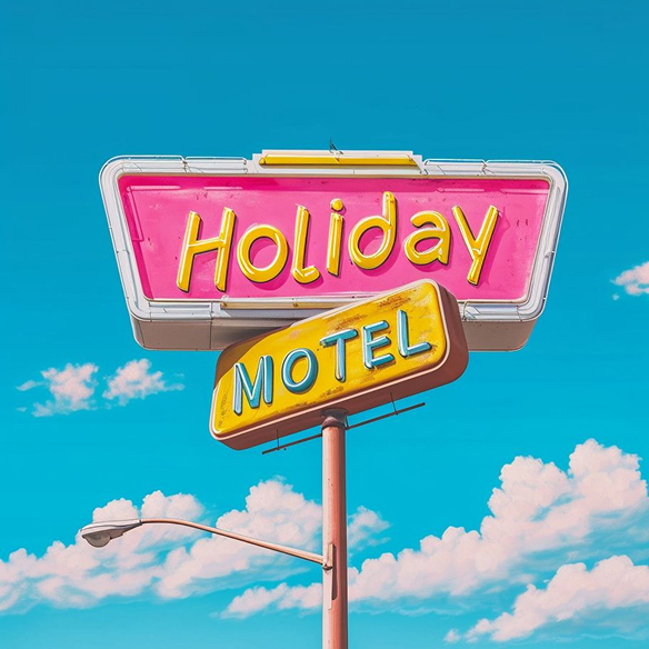
Classic diners come with an instantly recognizable visual language—chrome, checkerboard floors, neon signs, script lettering, and counter stools. The challenge was to capture that familiarity without simply recreating the 1950s. Dreamland needed to feel nostalgic at first glance, but fresh, expressive, and relevant to a new generation.
Brand Strategy
Dreamland is built around a simple idea: a diner can be more than somewhere to eat. It can be a familiar booth, a late-night milkshake, coffee poured before you ask, or simply a place that makes the everyday feel a little brighter.
At the heart of the brand is a sense of everyday optimism. Dreamland takes the familiarity of the classic American diner and gives it a fresh point of view. Warm, playful, and welcoming became the principles behind the identity, shaping everything from the logo and colour palette to packaging and the diner experience.
Verbal Identity
Dreamland speaks the way the diner feels: warm, familiar, upbeat, and easygoing. The language is simple and conversational, with a little personality when it counts. Nothing too polished or precious. It should feel like something you might actually hear across the counter.
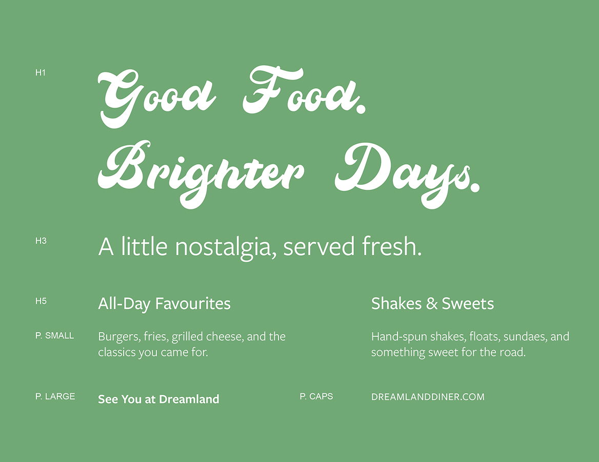
“Good food. Brighter days.” captures that voice in its simplest form. Short phrases such as “See you at Dreamland” extend the same feeling across menus, packaging, signage, and digital. Together, they give the brand a voice that feels optimistic without trying too hard.
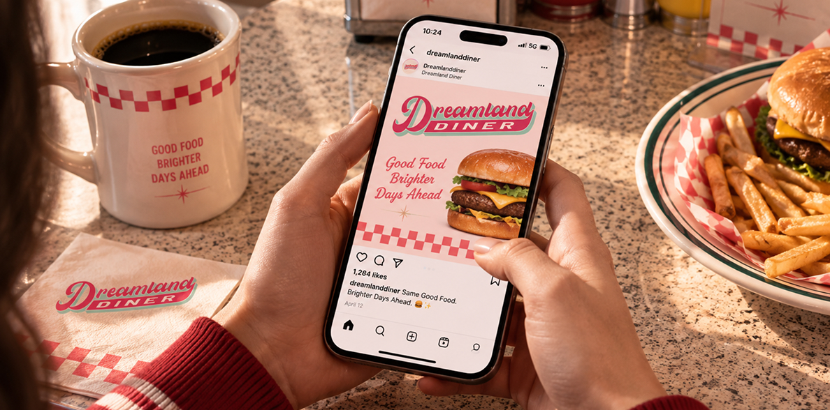
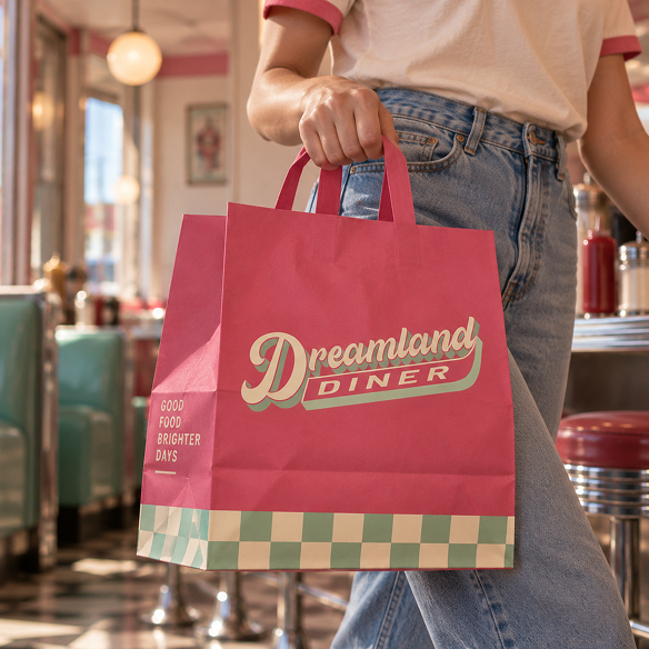
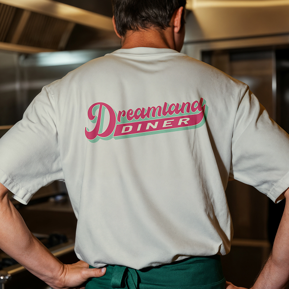
Good food, familiar faces, and a place that always feels a little brighter.
Logo
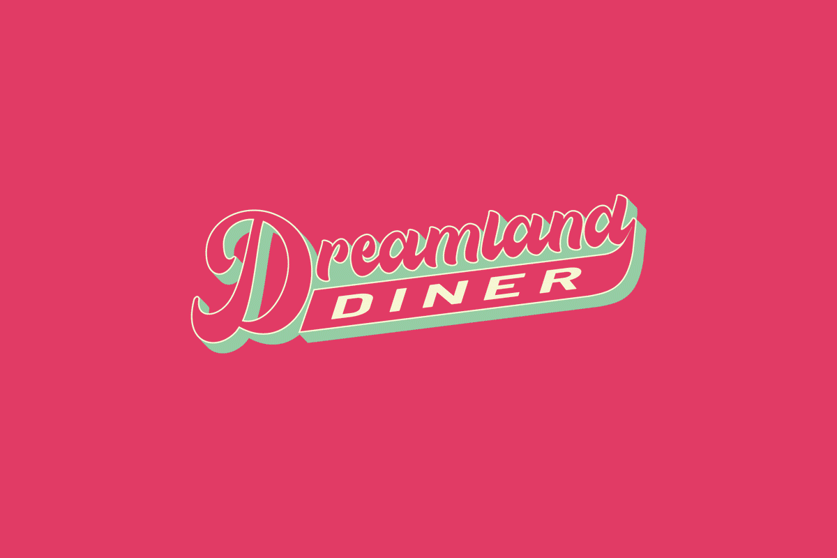
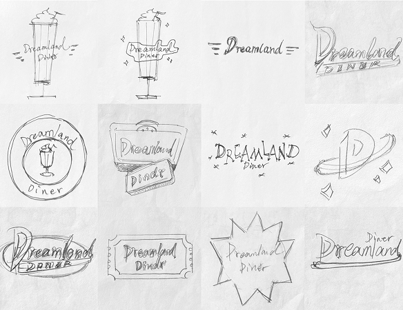
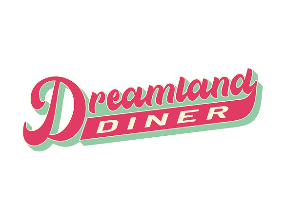
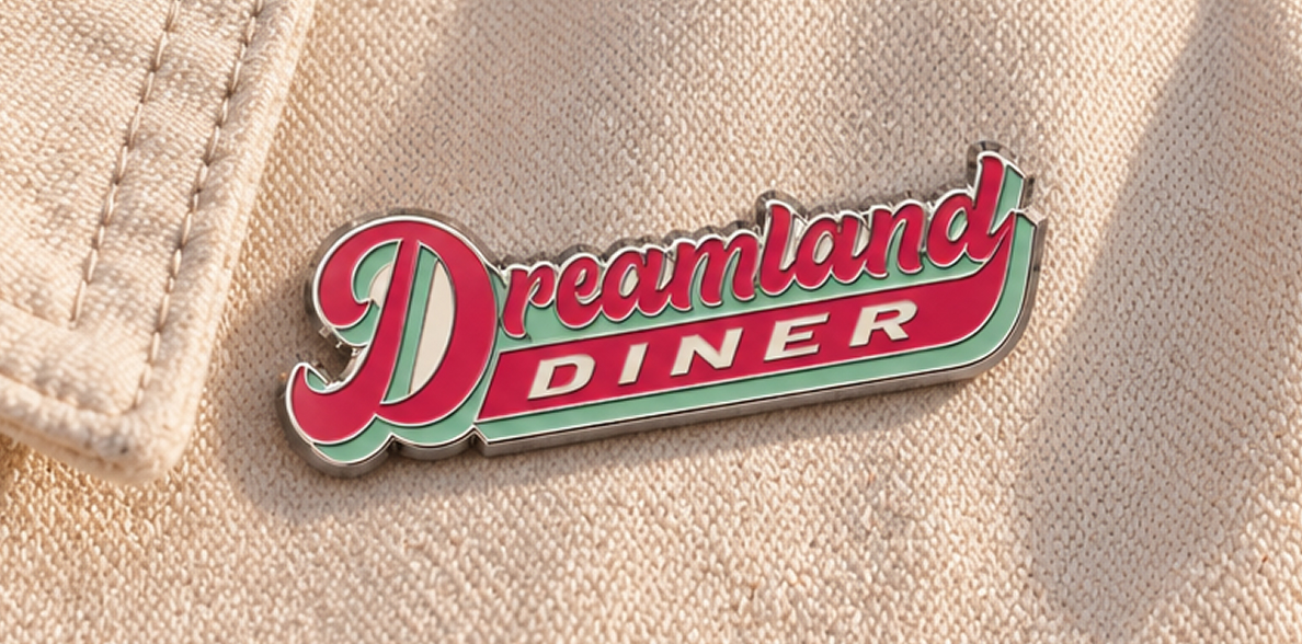
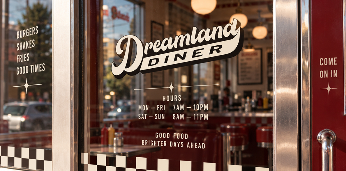
Drawing from the oversized roadside signs and hand-painted lettering of mid-century diners, the Dreamland wordmark combines expressive script with a strong, grounded Diner lockup.
Its sweeping form gives the identity a sense of movement and personality, while the layered construction allows the mark to translate naturally from storefront signage to packaging and smaller everyday touchpoints.
Visual Language
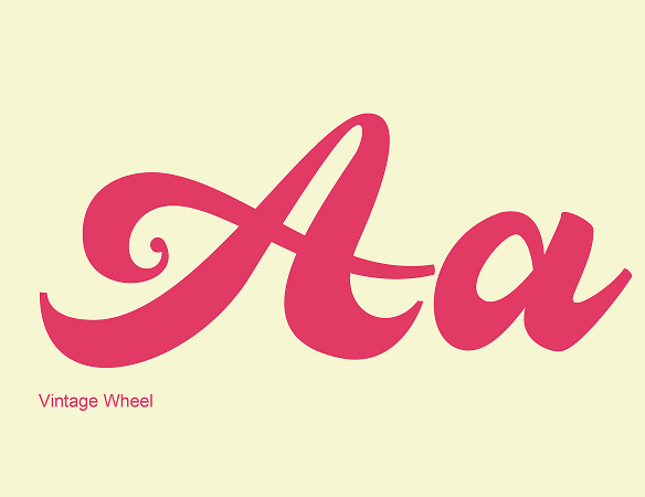
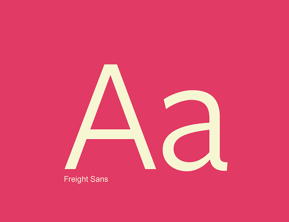
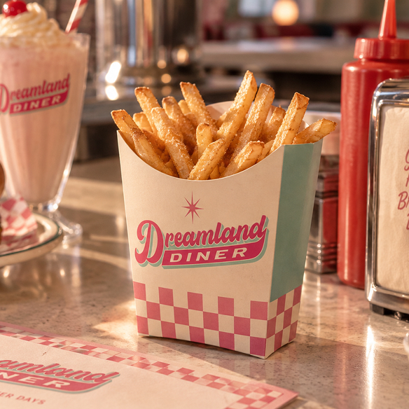
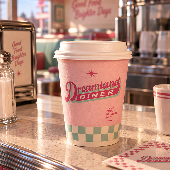
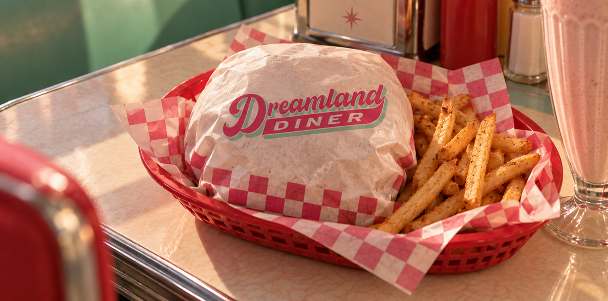
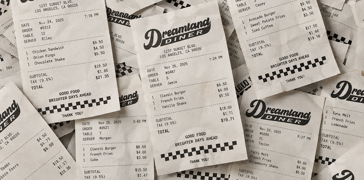
Dreamland’s visual language draws from the familiar details of classic diners: checkerboards, bold colour, playful type, and simple graphic accents. Together, they create a world that feels nostalgic and instantly recognizable without becoming a recreation of the past.
Pink, mint, and cream carry the identity across packaging, uniforms, menus, and digital. Checkerboards and small graphic details add personality where the logo does not need to. This gives Dreamland room to feel consistent without making every touchpoint look the same.

A familiar place to escape the everyday, find your favourite booth, and stay a little longer.
Like what you see?
Let’s build something just as good for you.