
In Between
A brand exploring identity, belonging, and the space between cultures.
In Between is a brand created around the emotional experience of living between cultures, identities, and places.
Through visual storytelling, the brand creates space for reflection, connection, and conversation around what it means to belong.
Living between cultures can create a sense of belonging to more than one place, yet never entirely to one. In Between was created to give that experience a visual language, turning the space between cultures, identities, and places into a space for connection rather than division.
Brand Strategy
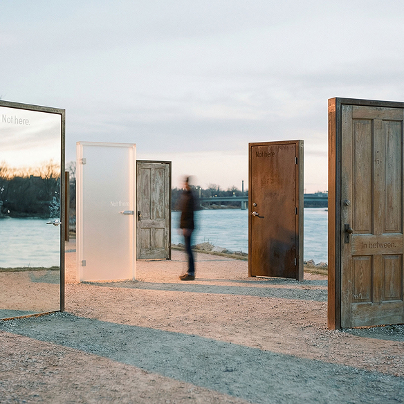
In Between is built around the idea that identity is rarely fixed. We move between cultures, languages, places, and versions of ourselves, often belonging to more than one world at once.
The brand reframes this space between cultures as a place of connection rather than division. Through visual storytelling, it creates room for reflection, empathy, and conversations around identity and belonging.

Verbal Identity
In Between speaks with a direct, reflective, and human voice. The language is simple and open-ended, leaving space for people to see their own experiences within it.
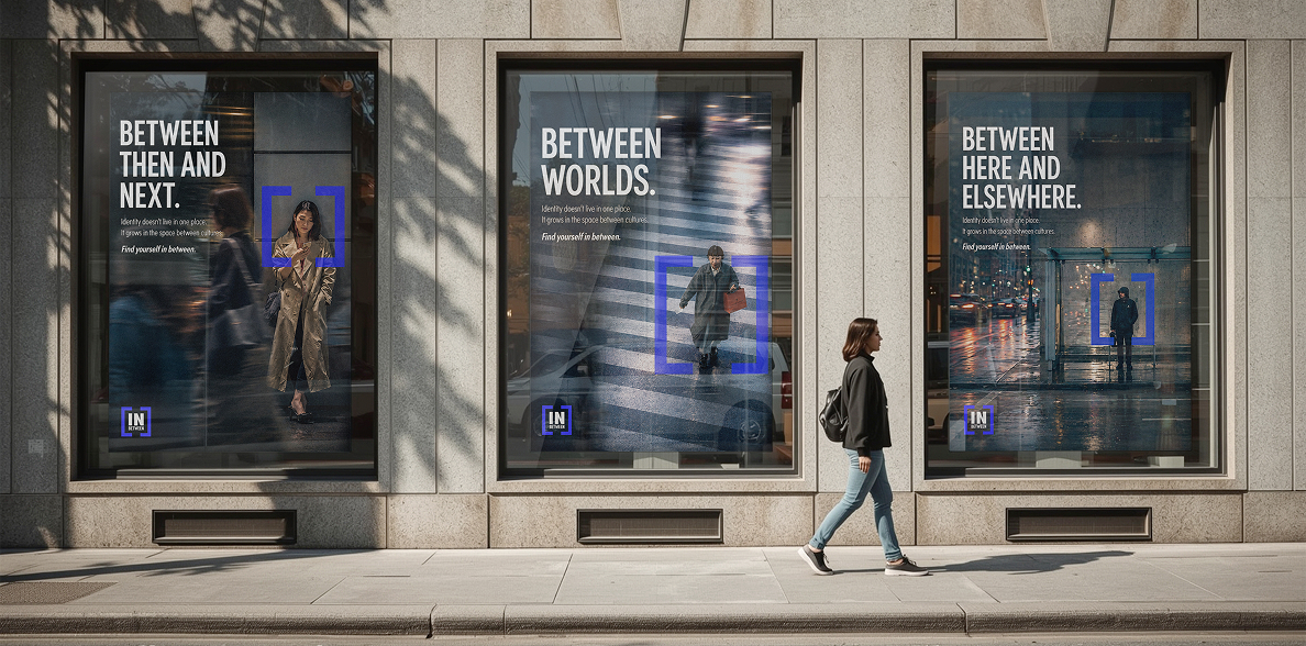
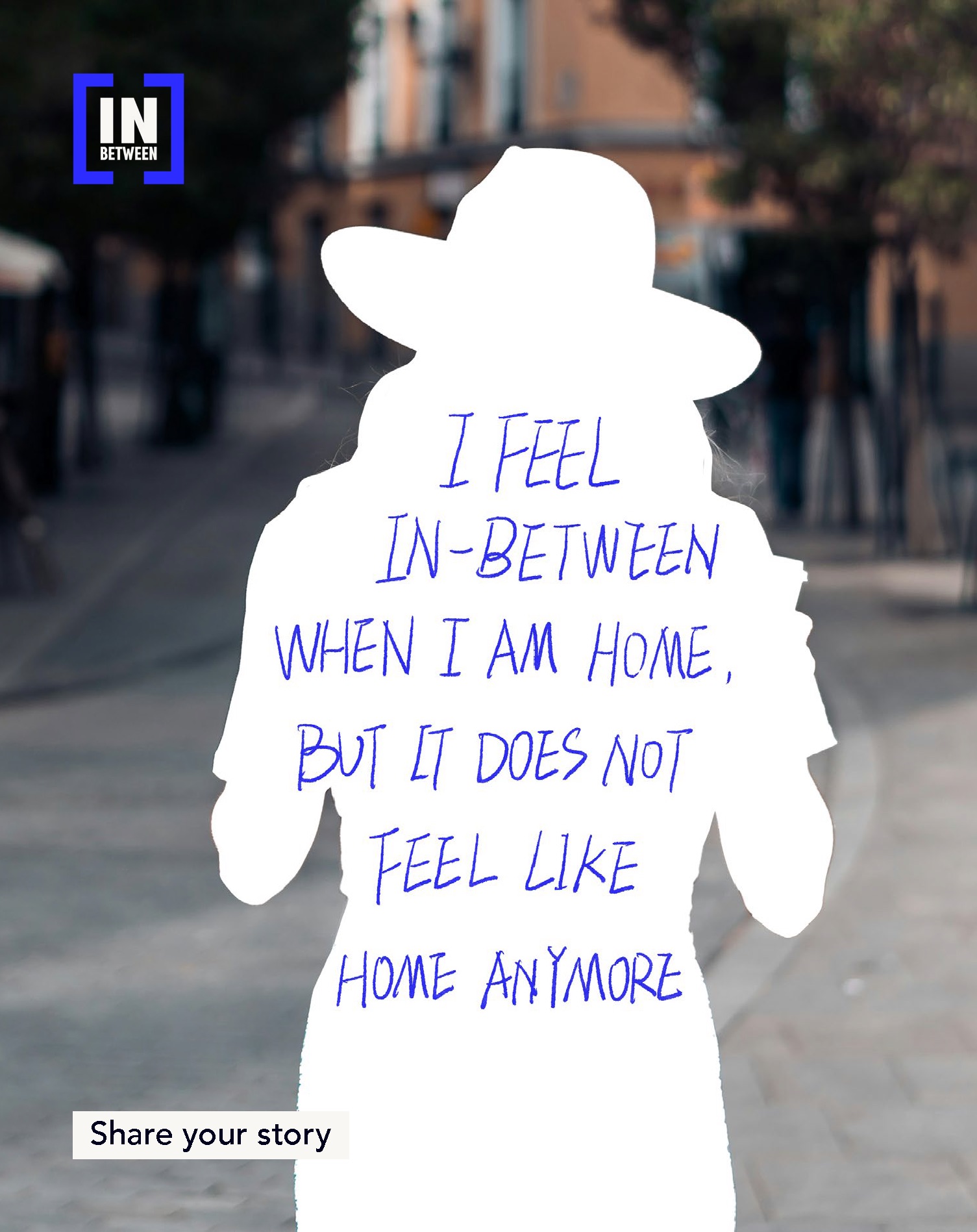
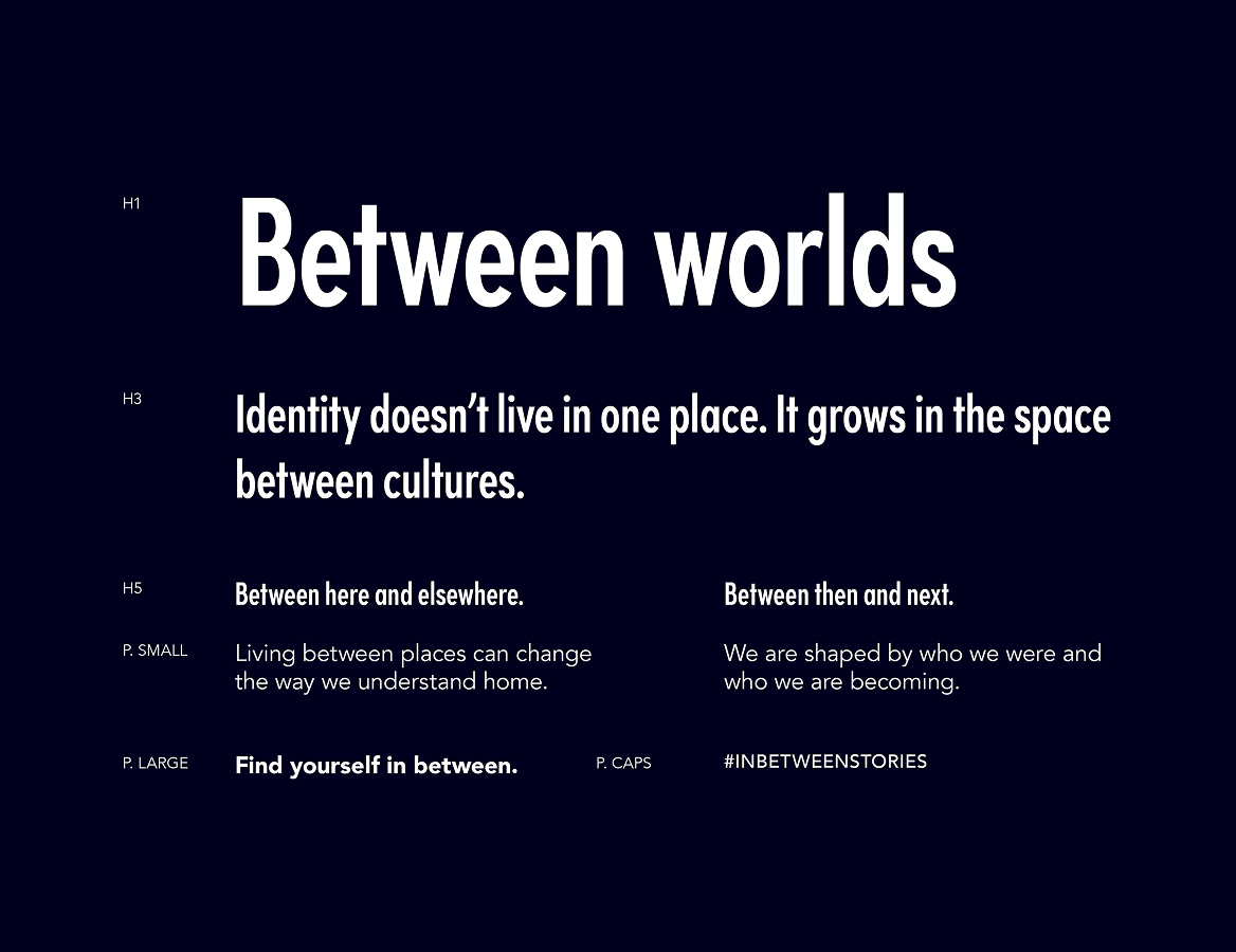
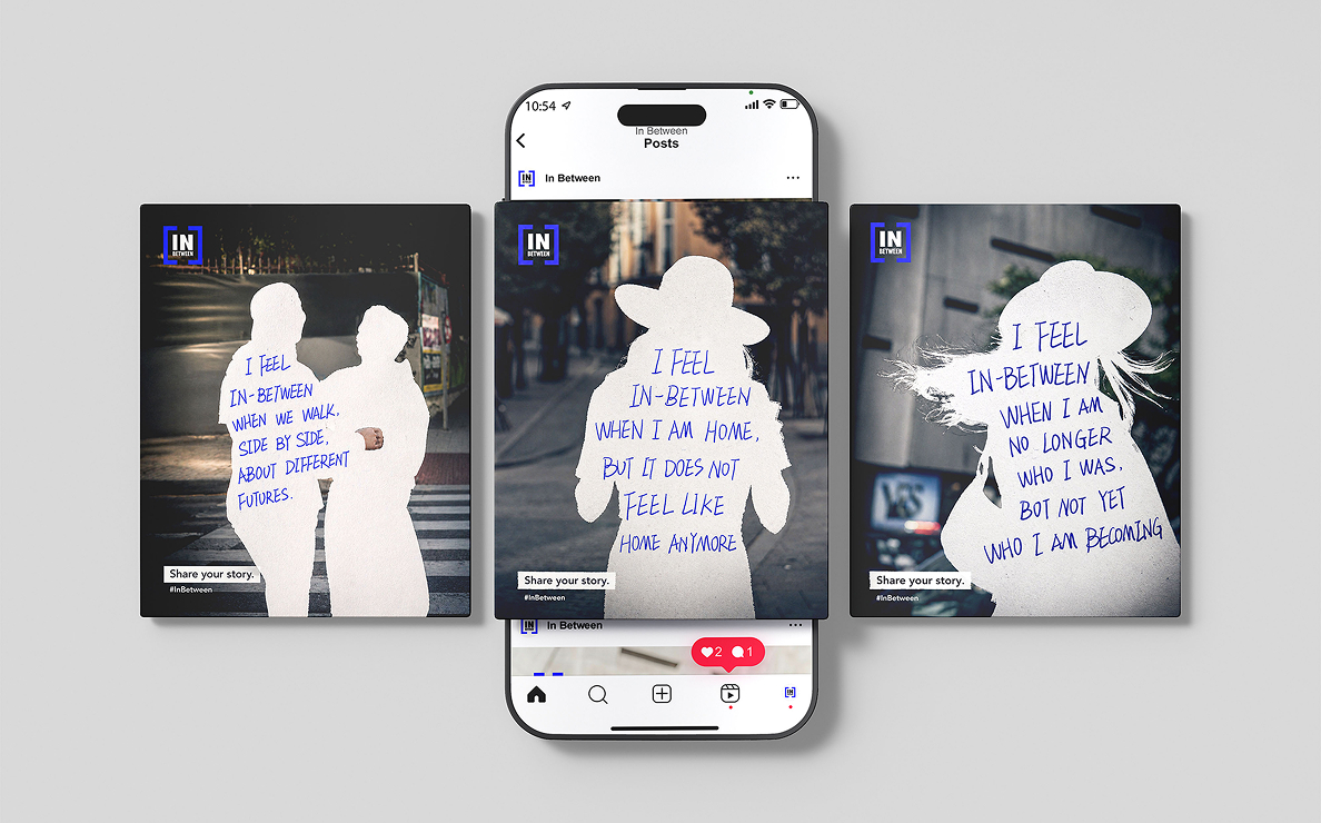
Phrases like “Between worlds” and “Between here and elsewhere” frame different states of transition. “I feel in-between when…” opens the language to others, turning personal experiences into part of the brand.

You don’t have to choose one place to belong.
Logo
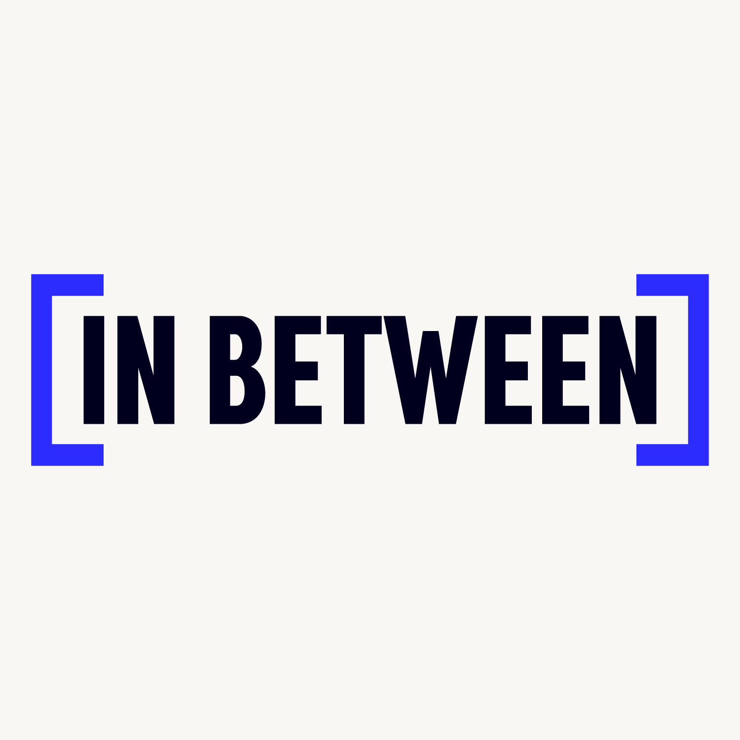
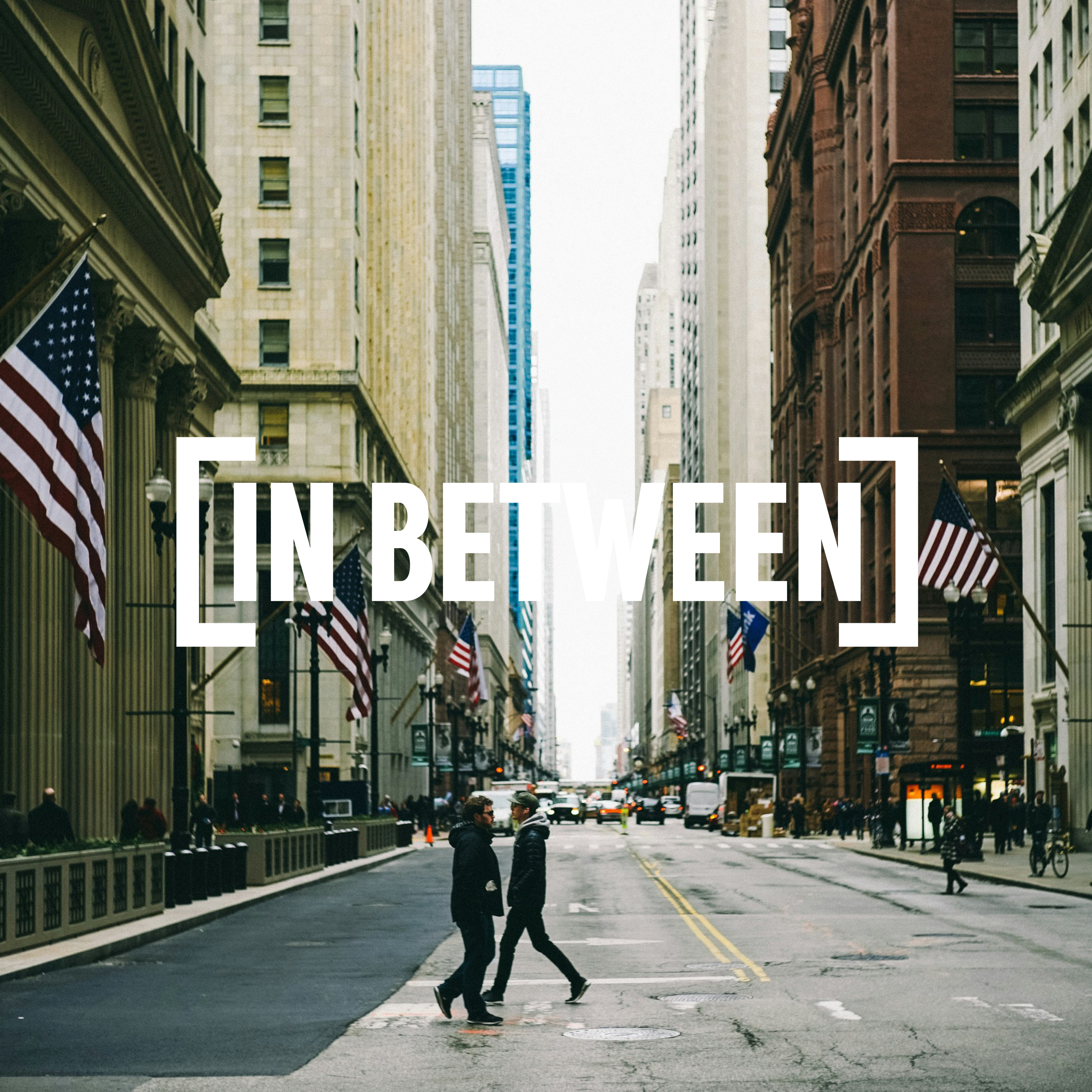
The In Between logo is built around two brackets that frame the wordmark, representing the space between cultures, identities, and places. Bold, condensed typography gives the identity a clear and confident presence.
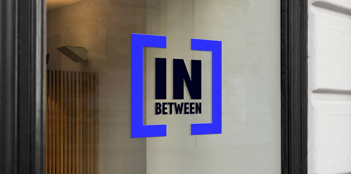
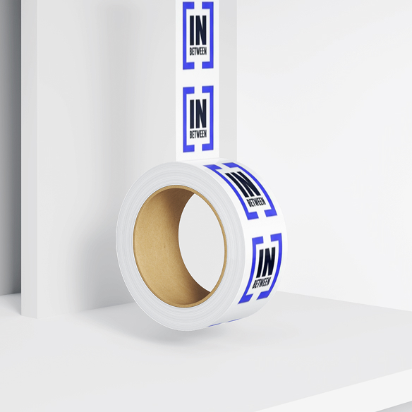
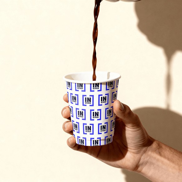
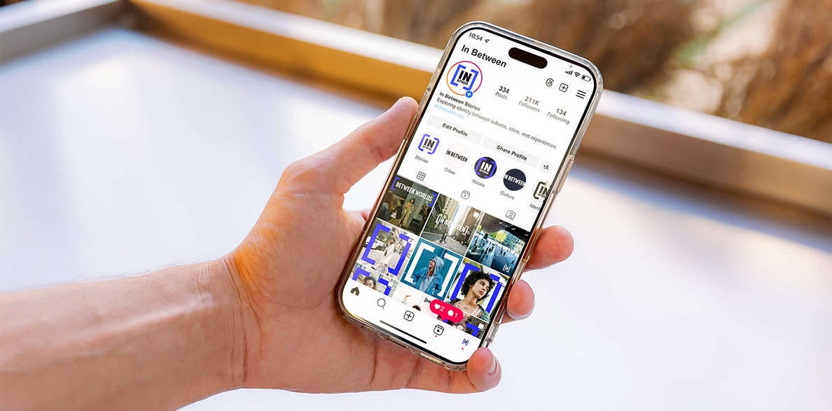
The stacked and horizontal versions adapt the identity to different formats while preserving its core concept. Together, the brackets and typography create a flexible, recognizable system across print and digital applications.

Visual Language
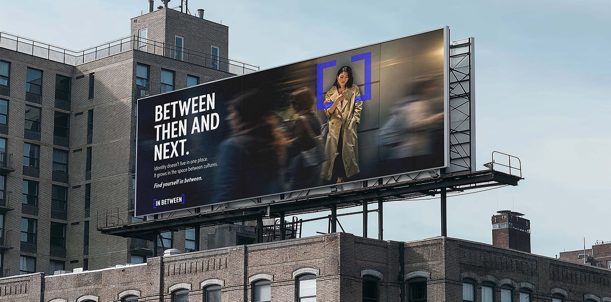
In Between uses bold typography, structured framing, and a focused colour palette to give an abstract idea a clear visual form. The system is direct and contemporary, designed to feel expressive without defining identity too narrowly.
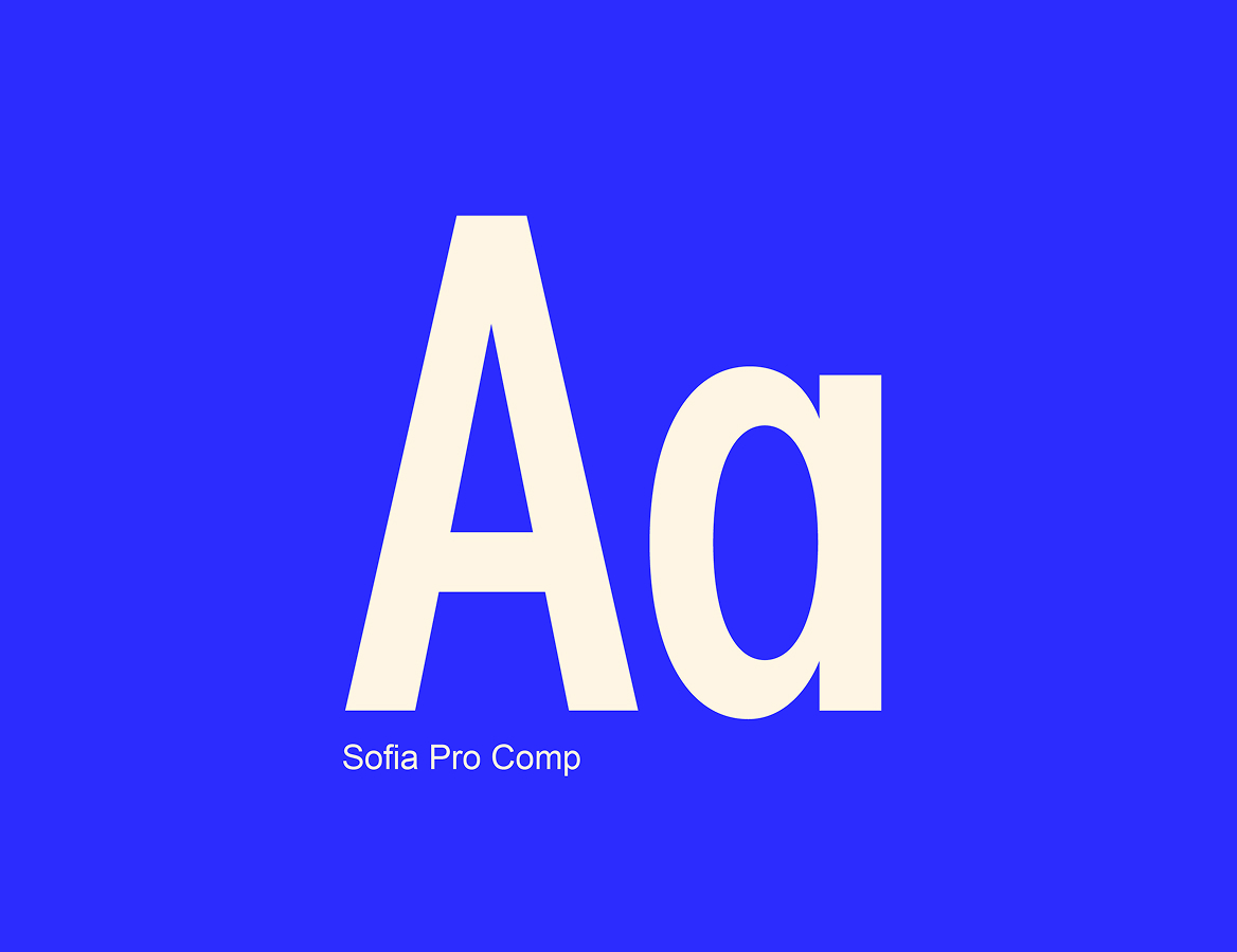
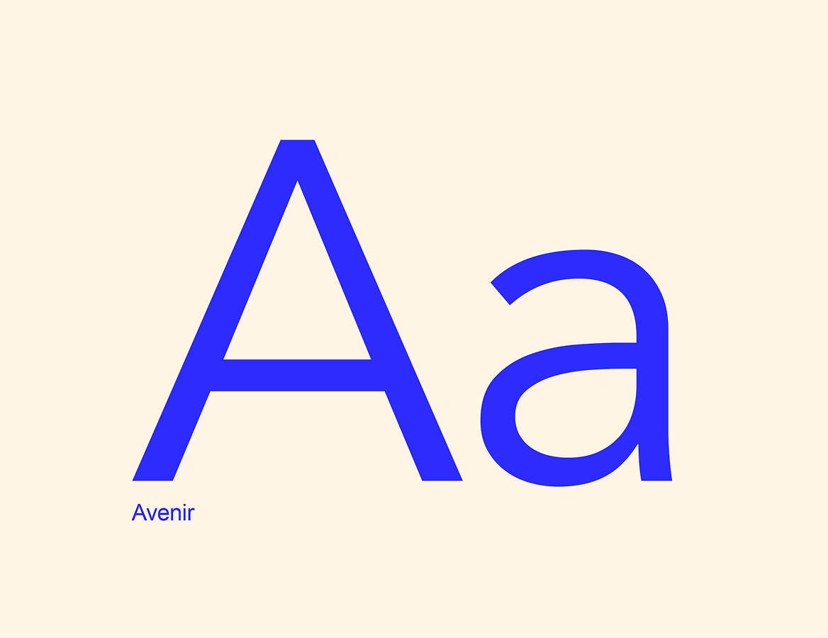
Sofia Pro Comp brings impact to headlines, while Avenir keeps supporting information clear and accessible. Deep blue, vivid blue, and warm neutrals create contrast, with the bracket motif connecting type, image, and layout across the identity.

Designed to make space for everything in between.
Like what you see?
Let’s build something just as good for you.